How to use this template
We had so much fun designing this template, and we want you to have just as much fun making it yours. Below you'll find a few quick tips to help you get the most out of this design.
Note: The instructions on this page are intended to be used alongside our free, step-by-step tutorial videos that walk you through customizing your GoLive template here.
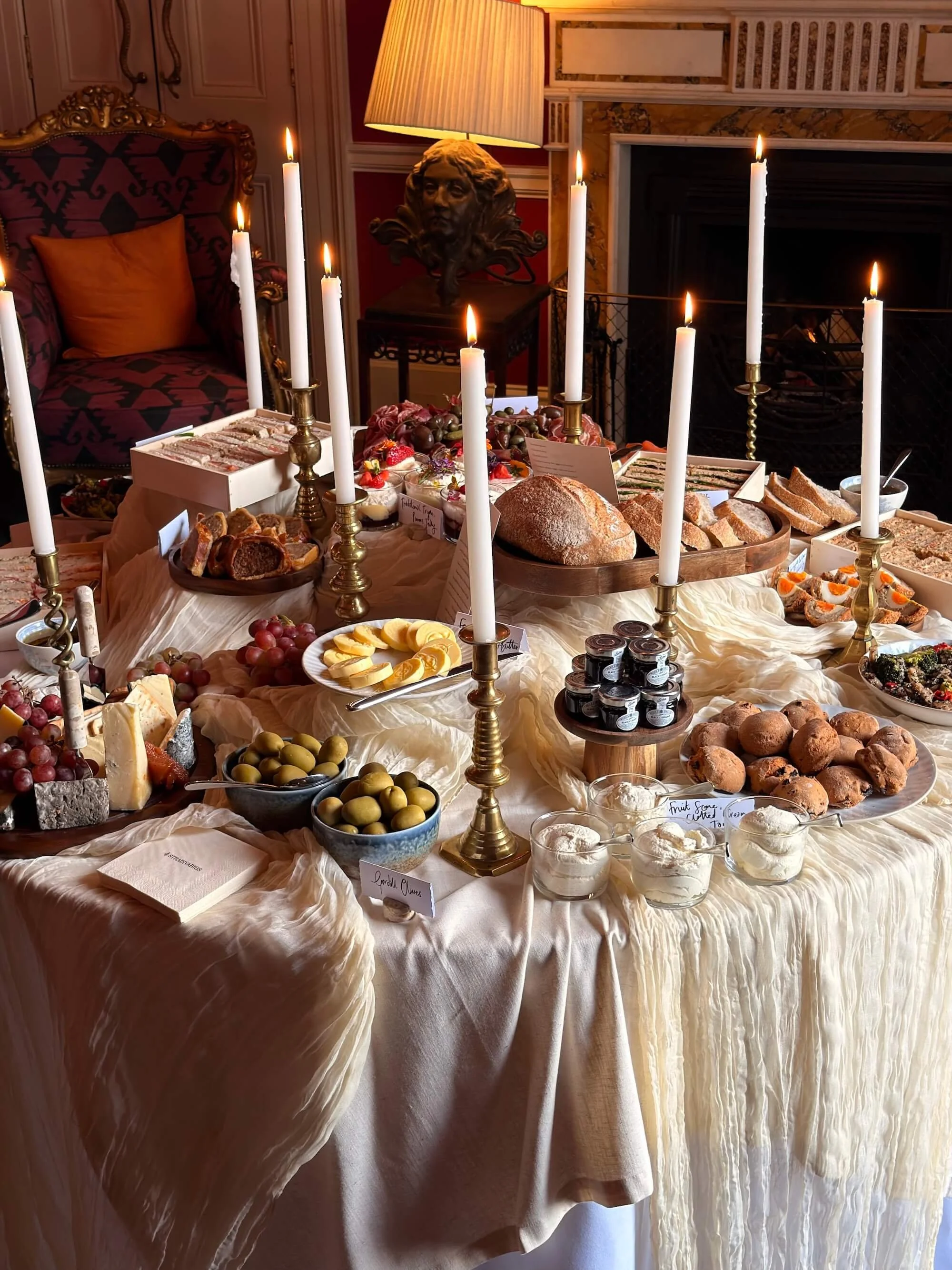
Animated, Stacked Image Gallery
Show off your latest photos in a gallery that looks like a stack of printed pictures, gently shuffling through one by one. It's a warm, tactile way to display your work, like flipping through a pile of prints on a table.
-
Hover over the section where you want the gallery, then click the + Add Block button in the top left corner of the section.
In the popup menu, choose Gallery.
Click the pencil edit icon on the new gallery block, then add your images.
Go to the Design tab and choose Slideshow as your gallery type.
Check the box for Automatically Transition Between Slides. This is what cycles through your image stack. You can adjust the value to control how fast or slow your photos shuffle through.
To keep the styling clean, uncheck every box except Transparent Background.
You’re all set!

Menu Styling
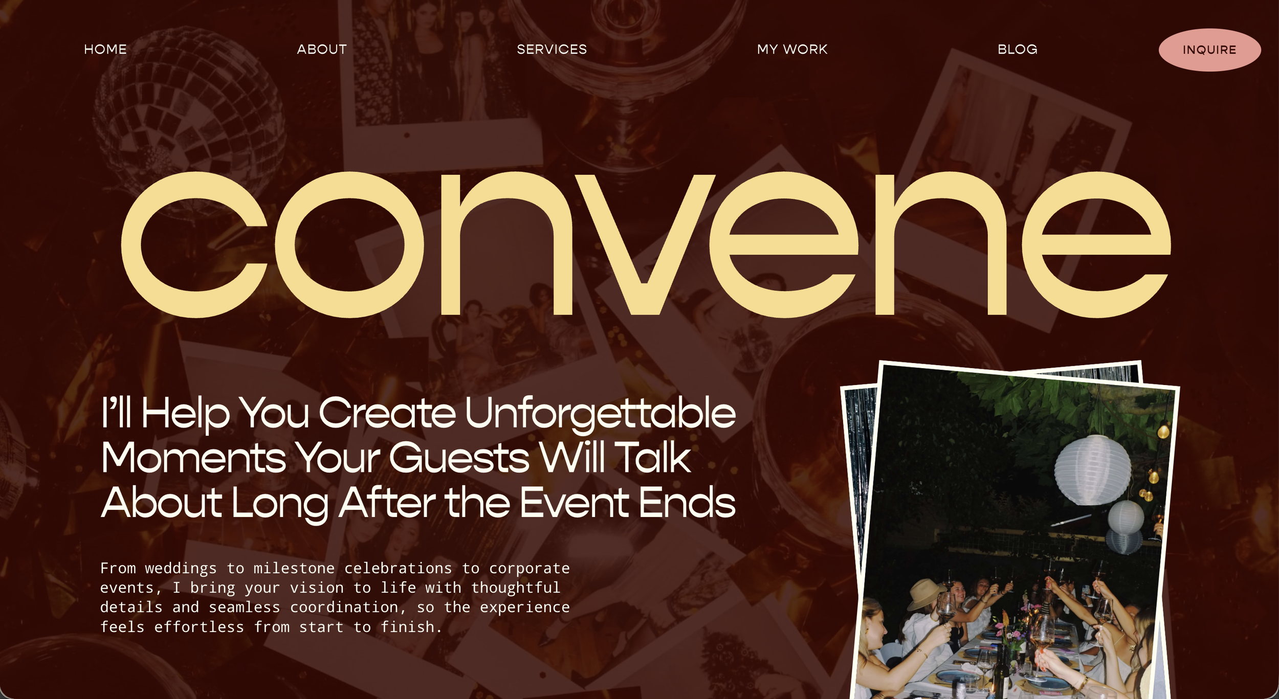
Give your header a bold, editorial look with your menu centered across the top and your large logo just below it. This style is built into your template, so choosing the matching layout is all it takes. Prefer a different feel? Any of Squarespace's other header layouts work too, but this one triggers the custom styling automatically.
-
Click Edit on any page, then click your header (the area at the very top with your menu and logo).
Click Edit Site Header.
Open the layout options and choose the layout with the menu on top and the logo centered below it. This is the one the custom styling is built for, so selecting it triggers the look you see in the example.
While you're in your header settings, adjust your logo size until it feels right. Alternatively, if you are using text for your logo, you can adjust your Site Title size in your Site Styles settings.
Adding Stripes to Sections
Want to add a little personality to your pages? These stripe designs are a fun, easy way to do it, and they pull straight from the color palette you set up in Site Styles, so everything stays on brand. There are four styles to choose from, and swapping between them takes one small edit.
-
Hover over the section where you want the stripes, then click the + Add Block button in the top left corner of the section.
In the popup menu, choose Code.
Paste this snippet into the code block:
<!-- Add Stripes - Options are: stripe-1, stripe-2, stripe-3, stripe-4 -->
<span class="stripe-1"></span>Once it's added, stretch the code block to fit the space. You can adjust both the width and the height.
To try a different stripe style, change stripe-1 to stripe-2, stripe-3, or stripe-4 and see which one you like best.
Stripe 1
Stripe 2
Stripe 3
Stripe 4
Polaroid Image Borders
Want to give a photo a little extra charm? You can add a classic polaroid-style border to any image with a single click. No code, no fuss. It's a fun way to make a photo feel personal and playful.
-
Click the pencil edit icon on the image you'd like to add the border to.
In the menu that pops up, click the Design tab.
Find the Lightbox toggle and switch it on. Your polaroid border will appear right away!
To remove the border later, just switch the Lightbox toggle back off.
Simple Image Borders
Want a clean border around an image, in any color you like? You can build your own using a simple shape block placed behind the photo. It's a flexible way to frame your images and keep them feeling polished and on brand.
-
Hover over the section, then click the + Add Block button in the top left corner of the section.
In the popup menu, choose Shape. This adds a square by default.
Drag the shape directly on top of your image, then stretch it to match the size of the image exactly.
Click the pencil edit icon on the shape block to start styling.
In the Design tab, under Styling, adjust the fill color if you'd like. This is separate from the border color you'll choose in the next step.
Change the Stroke from off to a solid line (the middle option). Once the stroke is on, pick the color you'd like your border to be.
Now send the shape behind the image so it reads as a border. With the shape block selected, click the Move Backward icon.
You're all set!

Stacked Folder Section
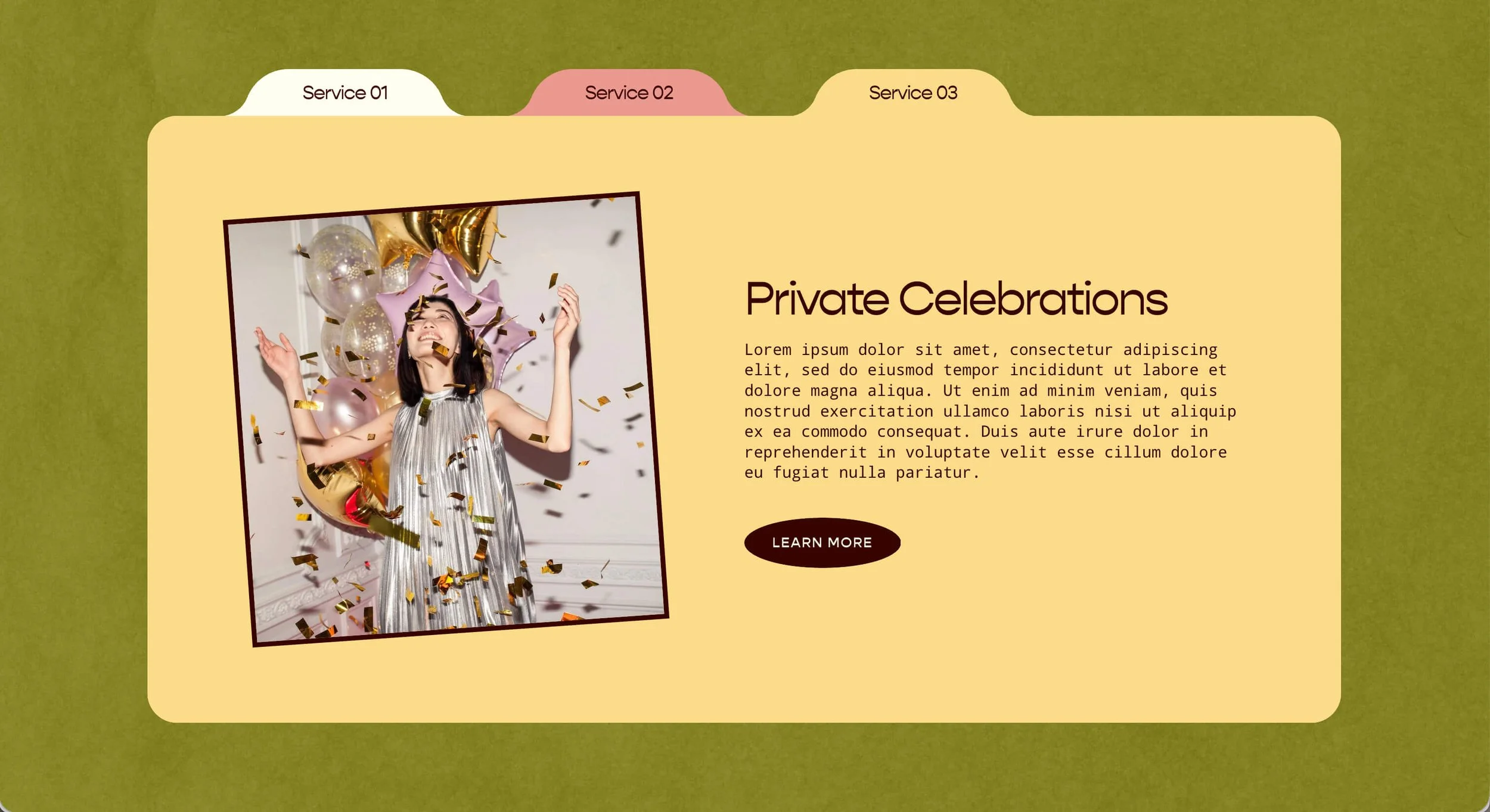
Show off your services or content in a set of playful folder "cards" that stack like tabbed files, each pulling its color straight from your Site Styles palette so the whole thing stays on brand automatically.
-
Click Edit on the page, then click Add Section.
Choose Team, Testimonials, or Calendar.
Look for the layouts with an i icon in the top right corner, and click the one you'd like.
Once the section is added, click the Edit Content button to set it up.
Go to the Elements tab. Under Items, toggle on Show Image, Show Title, Show Body, and Show Button. Keep all of these on, though you can toggle off Show Button for any folder that doesn't need one.
Go to the Design tab and choose Simple List from the options.
Set the Max Columns value to 1. As long as it's Simple List with just one column, the folder styling triggers automatically.
-
Click into each list item to add your content:
List Item Title: This becomes the tab at the top of each folder, so keep it short. Small labels like "Service 1" or "Item 1" work best and look the cleanest.
List Item Description: This is where the rest of your content goes, like your heading and your paragraph. To create a title inside the folder (like "Weddings"), just bold that line of text and it will style itself as the heading you see in the example.
Button: Add your button text and link here. It appears at the bottom of the folder.
Tilted Testimonials
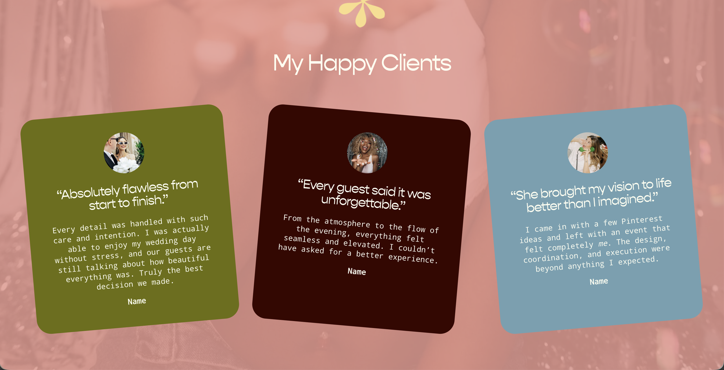
Let your happy clients do the talking with a row of testimonial cards that sit at playful angles across the section. Each card pulls its color straight from your Site Styles palette, so the whole set stays on brand automatically, no color picking required.
-
Click Edit on the page, then click Add Section.
Choose Team, Testimonials, or Calendar.
Look for the layouts with an i icon in the top right corner, and click the one you'd like.
Once the section is added, click the Edit Content button to set it up.
Go to the Design tab and choose Simple List from the options.
Still in the Design tab, scroll to the bottom and click Style.
Toggle on the Card option. This transforms your items into the multi-colored backgrounds with the slight tilt.
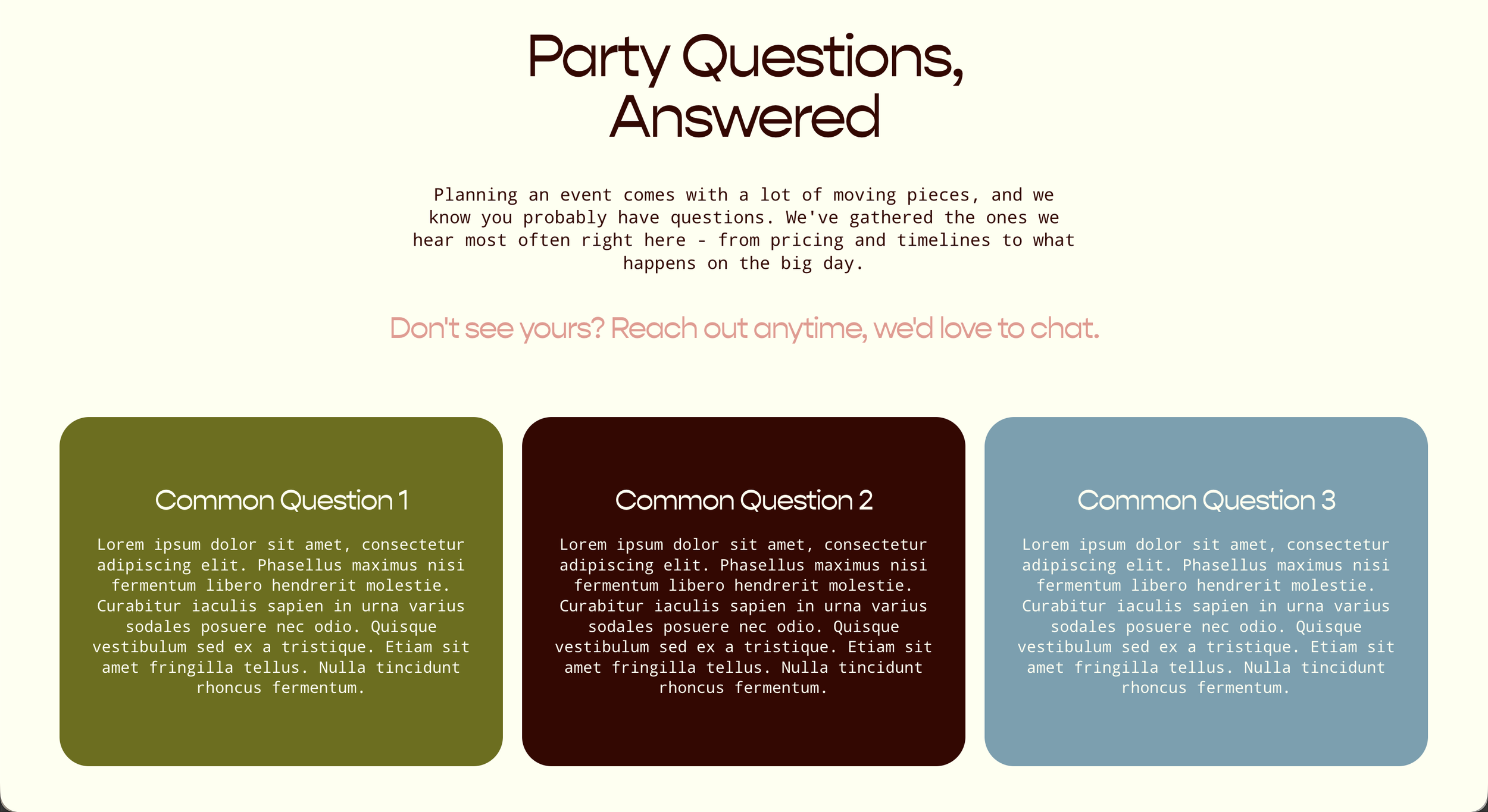
Colorful FAQs
Answer your clients' most common questions in a bright, easy-to-scan row of cards, each one pulling its color straight from your Site Styles palette so the whole set stays on brand automatically. It's a friendly, approachable way to handle the questions people ask most.
-
Click Edit on the page, then click Add Section.
Choose Team, Testimonials, or Calendar.
Look for the layouts with an i icon in the top right corner, and click the one you'd like.
Once the section is added, click the Edit Content button to set it up.
Go to the Design tab and choose Carousel from the options.
Still in the Design tab, scroll to the bottom and click Style.
Toggle on the Card option. This gives each question its own color, pulled from your Site Styles palette.